
Creating an authentic destination brand that embodies the heart of Arabia. True to the country and the people, warm, welcoming, and full of beauty.
-
Saudi Arabia welcomed leisure tourists for the first time in September 2019, the brief was to create a brand that was true to the country and its people, warm, welcoming, and full of beauty.
By 2023 the country, and its tourism offering had significantly developed and it was time for the brand to evolve in order to engage a cross-section of audience groups across diverse touchpoints.
After an extensive brand audit and stakeholder interviews, we were briefed to develop a strategic brand evolution. The Heart of Arabia was developed as a unifying brand idea that positioned the Kingdom as the most authentic tourist destination in the Middle East.
-
I was the lead creative on this project since the pitch, and for 4 years afterwards. It has been an enormous undertaking, developing the brand, workshopping with the client, managing the team and resources, briefing 3rd party suppliers, conducting brand introductions and doing an extensive brand audit.
The ambition for the brand identity from the outset was to challenge perceptions of the country by conveying a friendly and unexpected idea of what Saudi Arabia is.
Crafted with meticulous attention to detail, the resulting brand identity is an unexpected and harmonious marriage between traditional, intricate Saudi design and modern aesthetics.
-
An extensive suite of 9 detailed brand guidelines were created to help achieve coherence across all possible touchpoints.
There has been a multitude of sub brand identities created as part of the project, like the Ministry of Tourism, Saudi Tourism Authority, Tourism Development Fund, plus many programs like Saudi Rewards program and Hafawah training program.
Saudi Arabia's tourism sector experienced substantial growth, with record-breaking numbers of both international and domestic tourists. In 2023, the Kingdom welcomed 100 million tourists, surpassing its initial target seven years ahead of schedule according to the World Travel & Tourism Council (WTTC)
-
Brand positioning
Brand architecture
Tone of voice
Brand identity
Typeface design
Photography briefing
Digital design
Co-branding system
Endorsement system
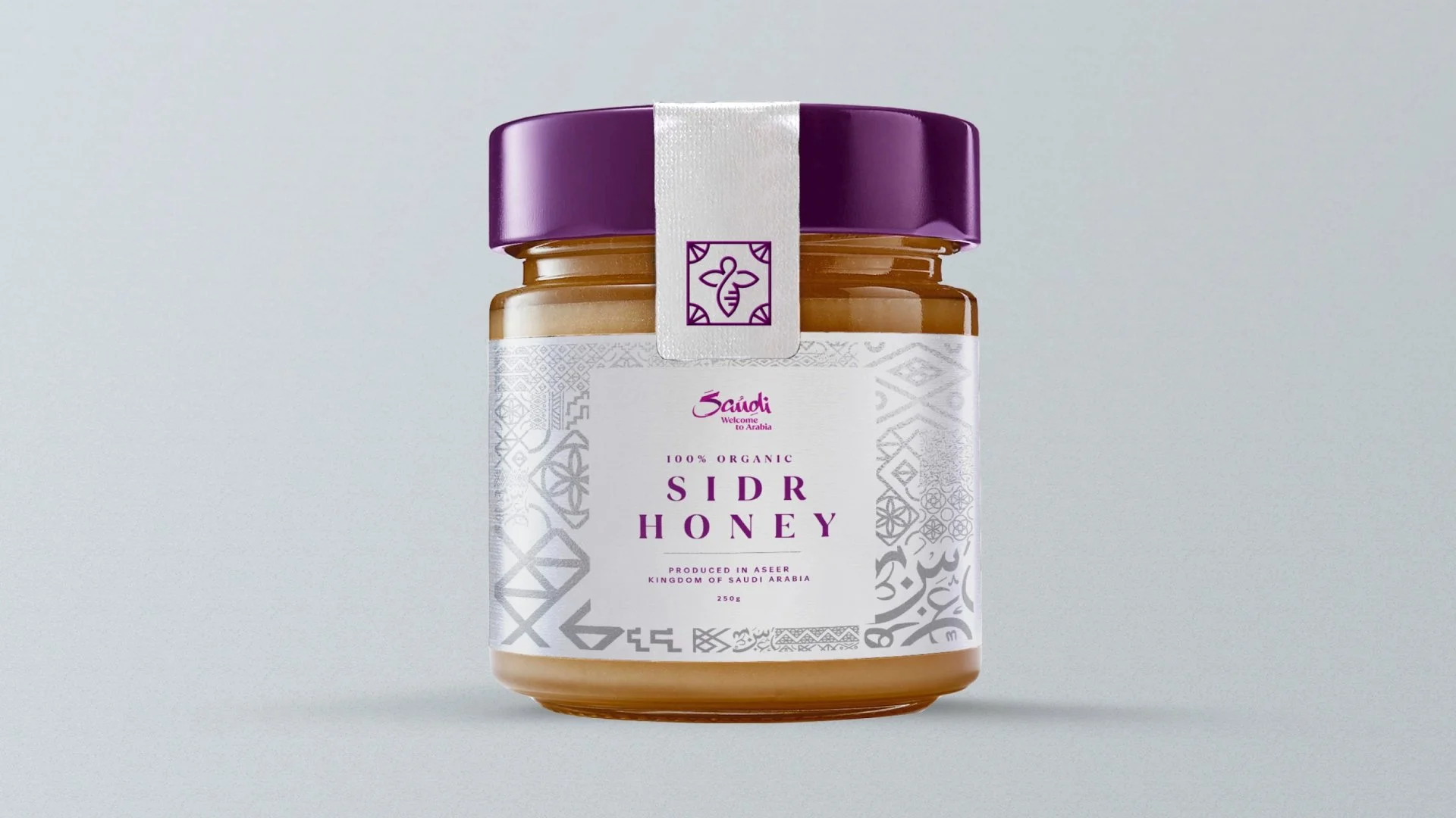
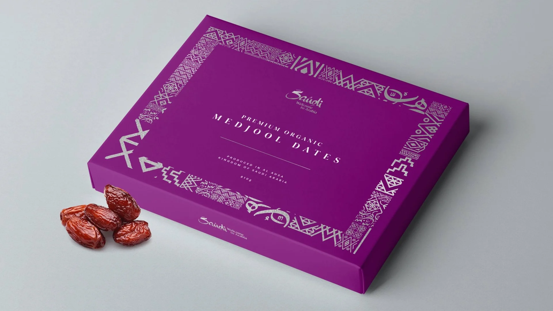
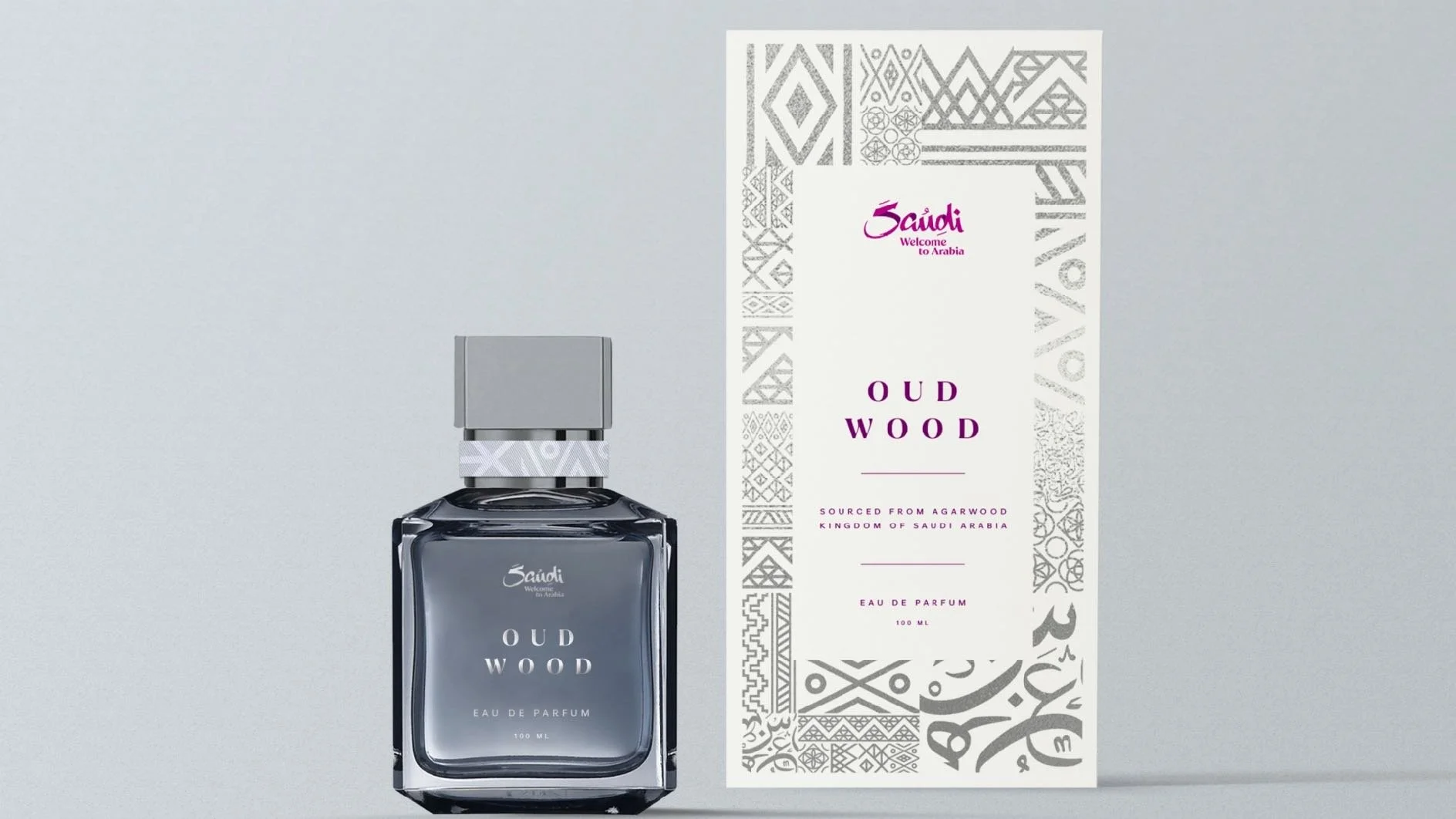
Merchandise design
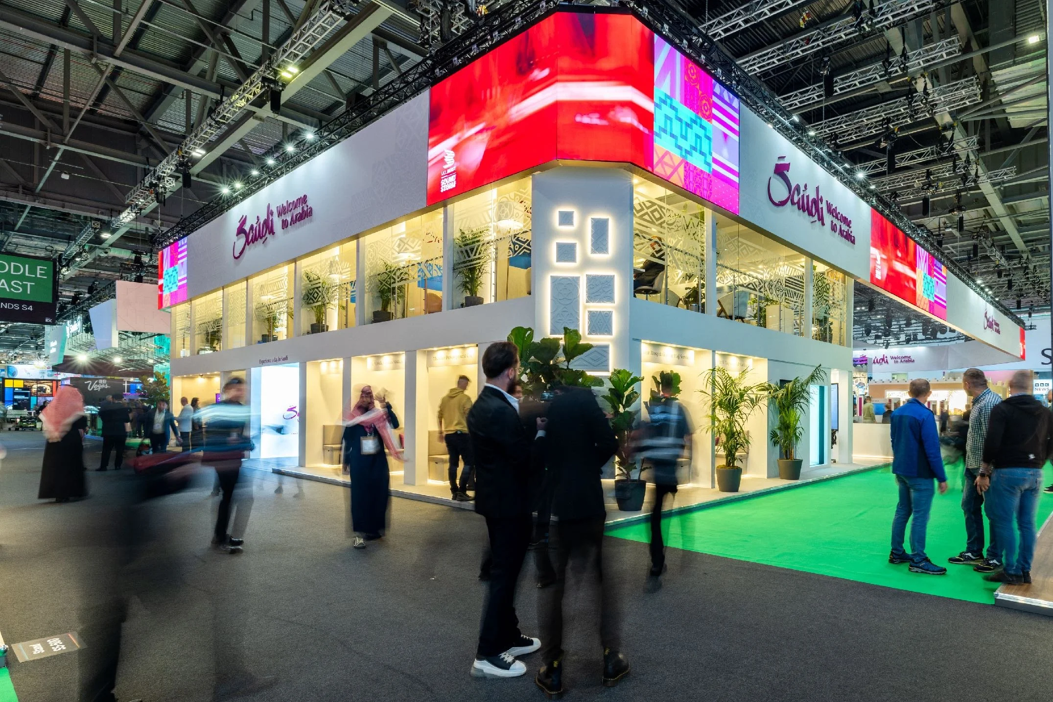
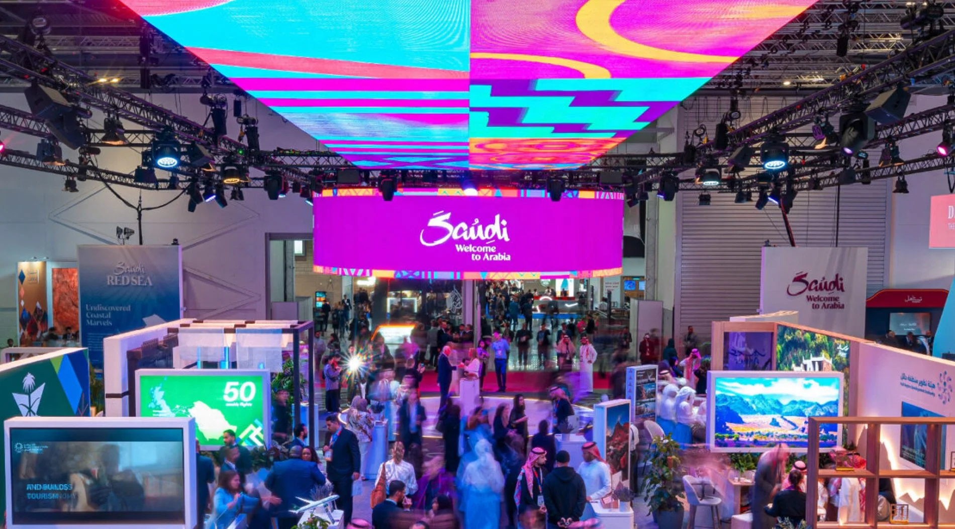
Exhibition stand direction
Advertising campaigns
Brand guidelines
A crafted signature from hand to heart
The logotype was crafted by hand using the traditional Arabic calligraphy “Bous” or reed, to create an authentic mix between Arabia and the world.
Working with international calligraphers to create a bespoke Japanese, Korean, Hindi and Chinese logotype
The soul of Arabia in every letter
The bespoke typeface was designed in collaboration with F37 foundry. Drawing from the characteristics in the logotype and the traditional Thuluth Arabic calligraphy style.
Saudi Serif and Saudi San Serif in 3 cases support Arabic, Latin, Cyrillic and Greek scripts, ensuring a uniformity and clarity to reach over 120 languages worldwide.
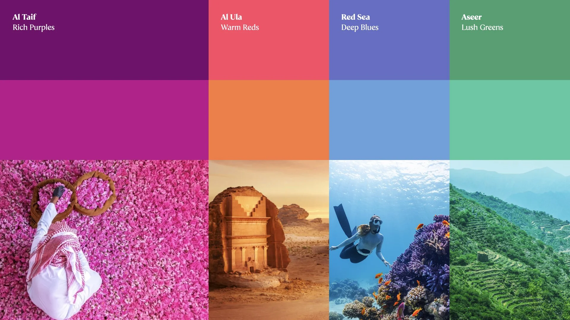
Inspired by the past, embracing the future
The colour palette is inspired by the diverse regions of Saudi Arabia channeling natural vibrancy and a welcoming and friendly look and feel.
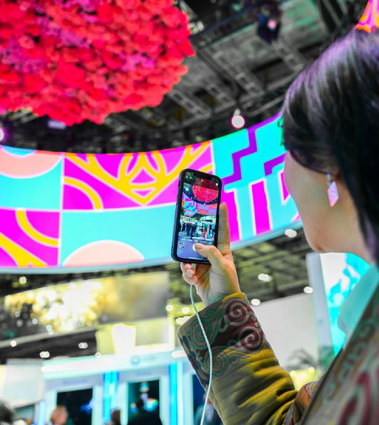
With meticulous attention to detail, the visual language was created from the long heritage of craft, art and design in the Kingdom. The tiles are unique to Saudi Arabia, and put together in a dynamic visual language system.
From a rich heritage to a vibrant kit
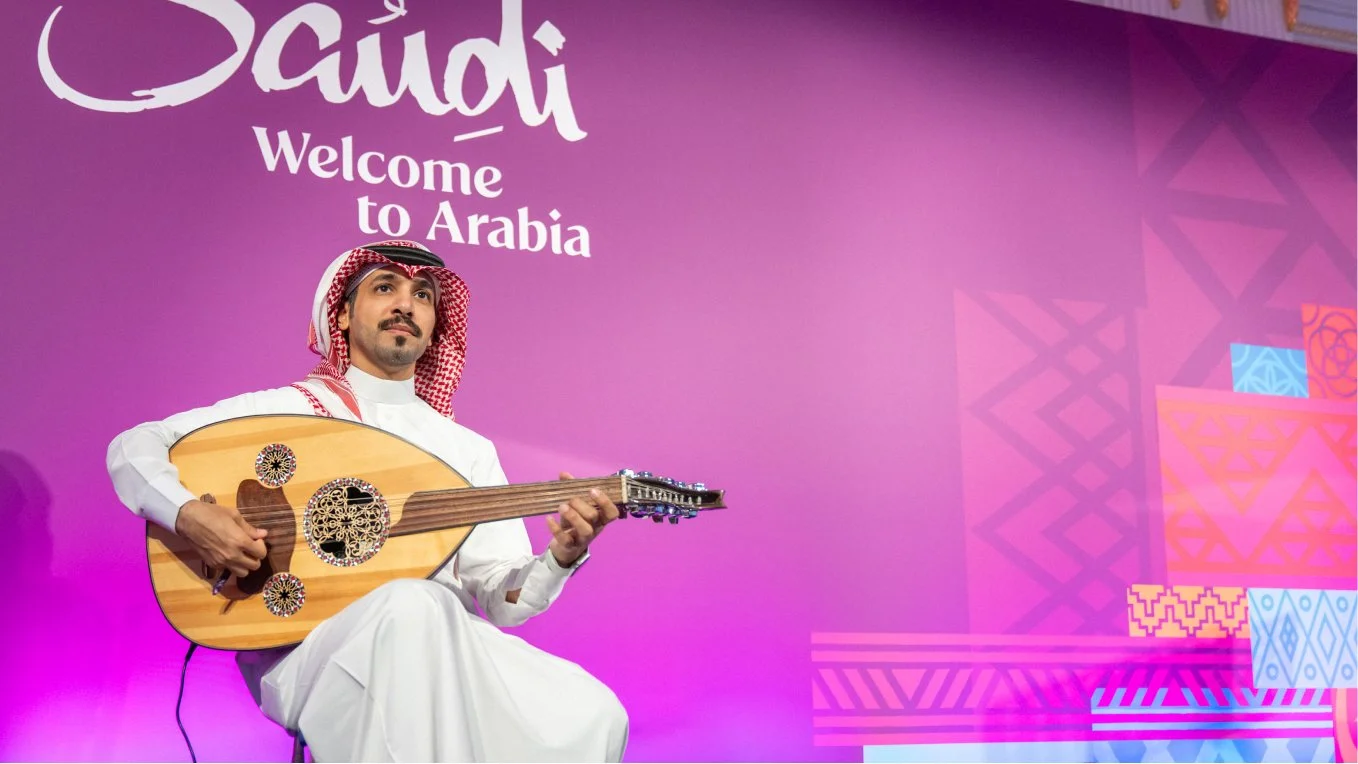
The visual language articulate the story of a warm and welcoming nation, excited and keen to showcase its hospitality and beauty to the world.
A tinge of Saudi vocabulary is introduced to the brand tone of voice to familiarise the audience with the Saudi culture and to spark conversations that could breaking the ice for the visitors.


Flexibility serving the brand needs
The brand assets come together to create a vibrant and diverse brand with a wide variety of applications that can be toned up or down depending on the target audience and intention of the communications.
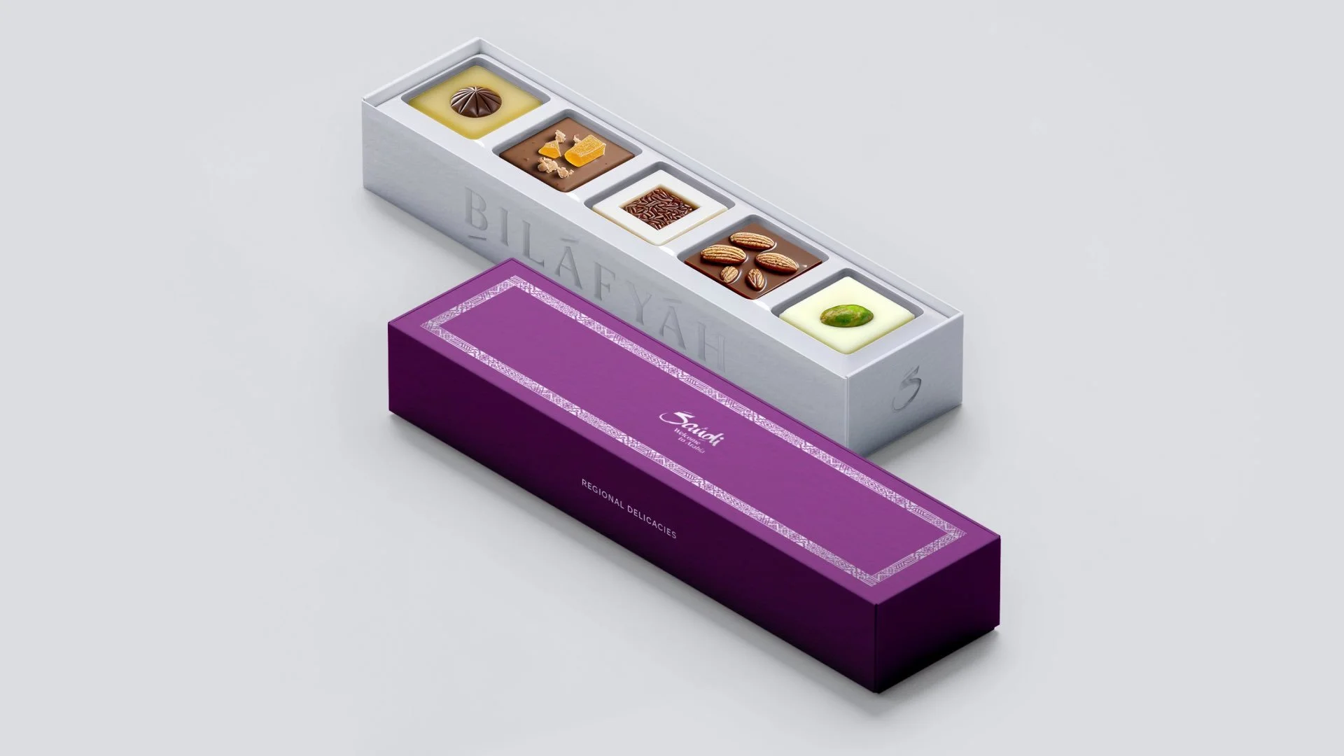
An extensive library of merchandise have been developed that stretch from mass giveaways used in events like the world travel market, to exclusive high end gifts that can be given to ministers and dignitaries.
Developing an easy to manage brand eco-system
An extensive suite of 9 detailed brand guidelines were created to help achieve coherence across all possible touchpoints.
The guidelines included a detailed photography briefing guideline, motion design, tone of voice, merchandise, endorsement and co-branding.
Additionally, a decision tree document was created to help consistency when building on the brand architecture.
The guidelines were then followed up with workshops and presentations for internal teams and third party suppliers.